
|
BUSINESS CARD DESIGN TIPS
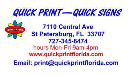
We have printed thousands of business cards for our customers. Some we have loved; others were real head scratchers. We have a few opinions on design. The card has to serve a purpose and be easy to read. In Florida, with an aging population, it MUST BE EASY TO READ. The text must be in contrast to the background, again EASY TO READ. A business card is not meant to be a canvas to display artistic ability. 1. Company name, hopefully that name is clear enough to indicate the business you are in. If not, describe the nature of the business. 2. Company address, this is important, people like to know the location, that it is a real business. 3. Your name and title, title not necessary. 4. Telephone number, email address, website, fax if there is one, maybe small logo, business hours. Do not add clutter or unnecessary information. QUESTIONS, make your life EASY, CALL US. Just a short casual conversation may be helpful to you. 727-345-8474, or email questions [email protected] |
MORE ON BUSINESS CARDS The paper the card is printed on is cardstock. There are too many cardstocks, here are the basics. 1. Matte stock, thickness or weight varies. Great stock for writing a note on the back. If the recipient can write a note on the back, they will keep the card. 2. Glossy cardstock, shiny, pretty, more difficult to write on a blank back side. 2 sided cards, print on both sides. 3. Super expensive and fancy cards get discarded just as quickly as plain ones. Keep it simple and very clear as to what business you are in. |